IBM Supply Chain Business Network (SCBN) is a cloud-based suite of products used to streamline supply chain connectivity and expand B2B transaction visibility to help predict, assess and mitigate disruptions. I was responsible for redesigning the Customer Center experience, the launchpad and maintenance hub of this product suite, as the sole designer in the early stages of this project. As a solo designer, I was responsible for the initial research, identifying the as-is flow, identifying common frustrations with the user experience, implementing the solutions into a redesigned interface and prototyping for a proof of concept.
The work that I had completed was used as a demo to the Senior Vice President and Vice President of design of the Cognitive Applications business unit to be approved for funding and development. After funding approval, I worked as a product designer alongside a team of 5 other UX designers and 1 content designer, to continue to iterate and ship the project for development in a 6 month timeframe.
To begin the redesign, I first needed to understand the types of tasks and use cases that our users go through. I began by speaking with the project managers and existing development managers involved in the current product. Speaking with those stakeholders allowed me to understand their perspective of the users, their painpoints and their needs. Insights that I gained from those conversations were things like:
I also had the opportunity to speak to both internal support users and external customers that were willing and eager to speak with us and provide feedback throughout the duration of the redesign. Using Cisco WebEx, a web conferencing application, users were able to share their workflow and everyday tasks through screen sharing. There were a number of different types of users that we had interviewed:
IBM Support Administrators
IBM Support Users
Company Administrators
Company Users
Users were able to voice their complaints and frustrations with the product, and by watching their workflow, we were able to gain insights on the pain points that users have adapted to. Some examples of the questions and insights that we gathered are the following:
Questions
Observed Feedback
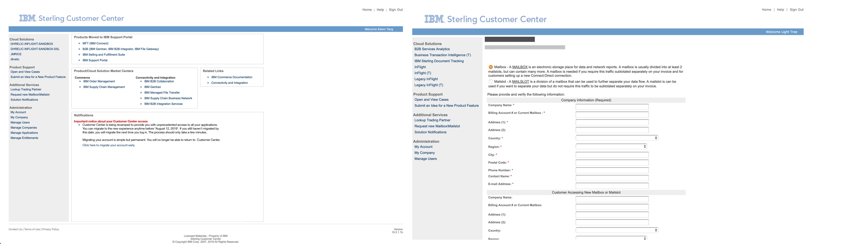
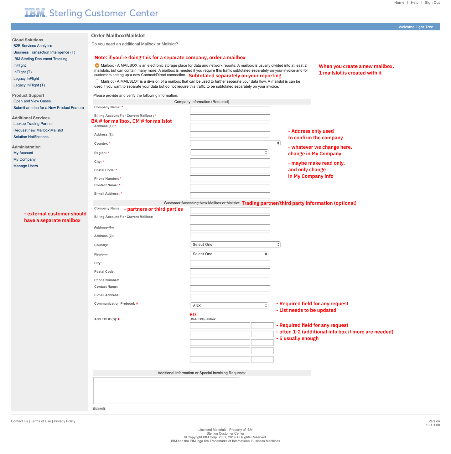
Those are examples of the insights that we found during user research sessions for the form below for ordering a mailbox or mailslot.
Simplifying Forms
We made sure to take advantage of redesign opportunities that didn't require large development overhauls. Tasks that were meant to be simple were requiring a lot of time and resources from the IBM Support team, due to the poor as-is experience. Forms were restructured and simplified to reduce confusion. Like previously mentioned, by speaking to internal and external users and observing their tasks, we found that:
Form Length
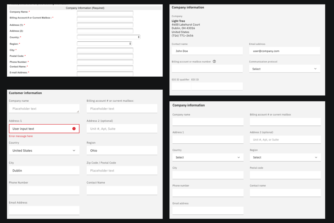
To begin simplifying the form, we identified the required fields, deprecated fields and how each field is being used. We found that by having too many fields, users would feel overwhelmed and feel the need to fill in every single field, even if it meant including irrelevant information. We had to find the proper balance of simplicity and usability, making sure to cover the most common use cases, if we removed commonly used fields, we could be generating more Support tickets rather than improving the experience. For example, we found that the EDI ID/Qualifier fields were often filled with 1 relevant field and other random ID's in the excess fields; in this case, we chose to use a single EDI ID/Qualifier field.
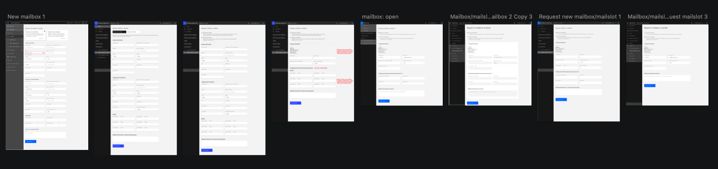
Removing Redundancy
Speaking with users, we found that there were almost no use cases where users would enter different company information other than their own. To reduce the redundancy of entering the same company information in subsequent forms, we chose to default the users company address, using the address listed in their company user account information. By replacing those fields with the address text, instead of removing the fields completely, we are able to further shorten the form length and reduce possibility of error, while allowing the user to verify their address.
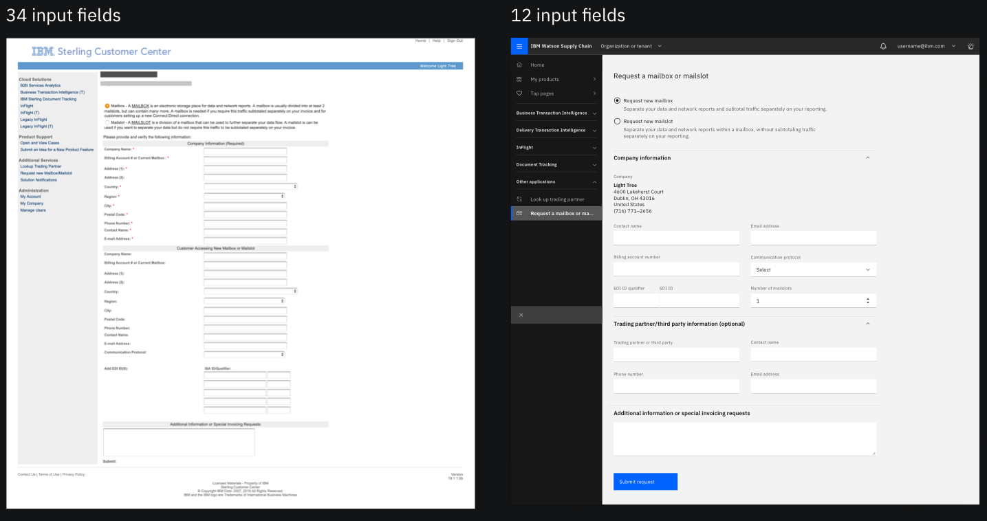
Error Checking
Following modern form submissions patterns, we introduced error checking to required fields. IBM Support users had come across experiences where forms were left empty, with the user request detailed in the 'Additional comments' field instead. By introducing error checking, we are avoiding this scenario, as well as removing the possibility of the user accidentally skipping fields.
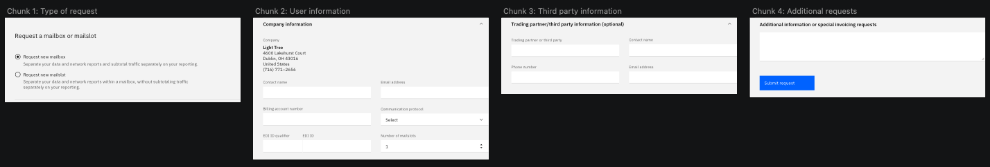
Content design, messaging and form structure
Much of the messaging within Customer Center used technical jargon that alienates less experienced users. By simplifying the content design and introducing help tooltips, we reduce the possibility of the user contacting Support due to lack of direction. Structuring the form into logical chunks helps align the user to the purpose of each chunk. For example, the section 'Customer Accessing New Mailbox or Mailslot' has been renamed to 'Trading partner/third party information' and by sectioning out the form chunks into 'User information' and 'Third party information', users can avoid filling in the wrong party's information.
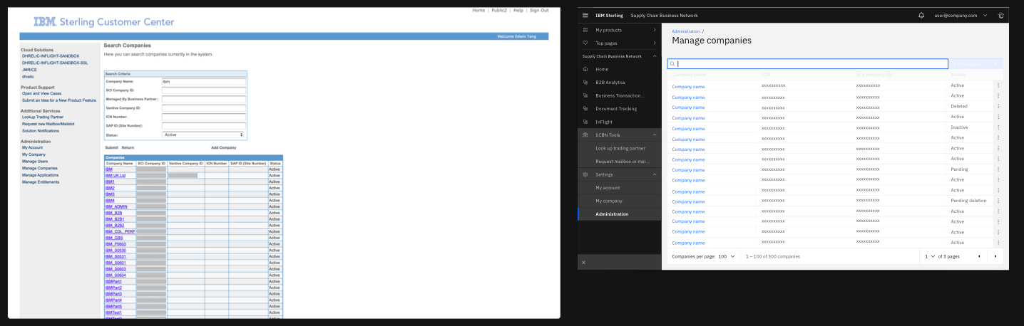
Search Pages
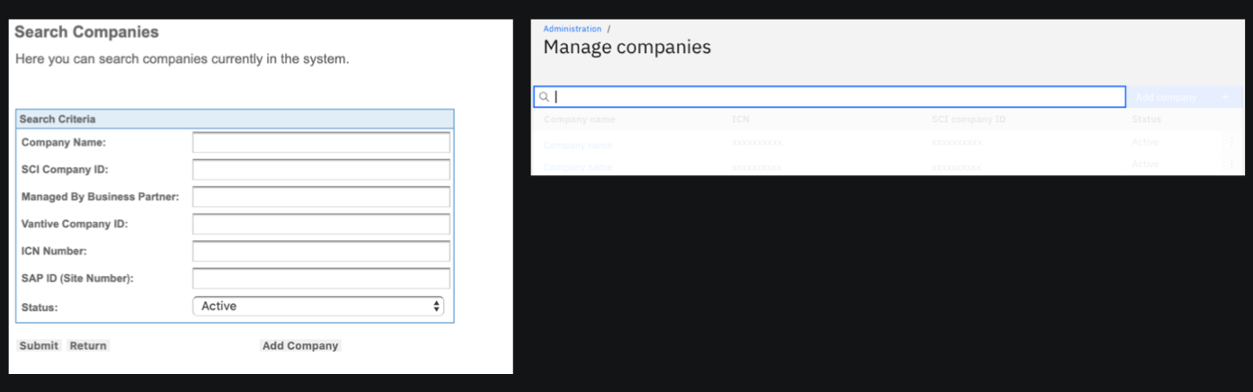
Customer Center contains multiple search functions for different use cases. They all follow a similar pattern, so revamping the search screen interactions was a high impact decision, able to improve the experience of multiple user flows at once. Key insights that drove our decision making on this screen were:
Aligning to modern expectations
In the legacy product, users are presented with multiple input fields for different search categories. It isn't clear to users what type of search is being conducted (equals, contains, starts with, ends with), and if users choose to search with multiple fields, it isn't clear how the search incorporates the extra terms (AND/OR). By following modern search standards, like Google search, we chose to move to a single inclusive searchbar. Using a single searchbar allows for us to follow user expectations that the following search will be conducted by keyword, and is inclusive of any search terms entered.
Performance
Conducting searches that return a large number of results would previously return all the results in a single long table. Aside from the overwhelming amount of results returned, page load times between large searches could potentially anywhere between 30 seconds, to over a minute. Using pagination to chunk search results into smaller portions, load times can be decreased by calling for multiple small results, instead of calling for one very large result. By implementing pagination, we were able to pre-populate the table prior to any search terms being entered, allowing for users to browse and explore their lists.
Migrating Users
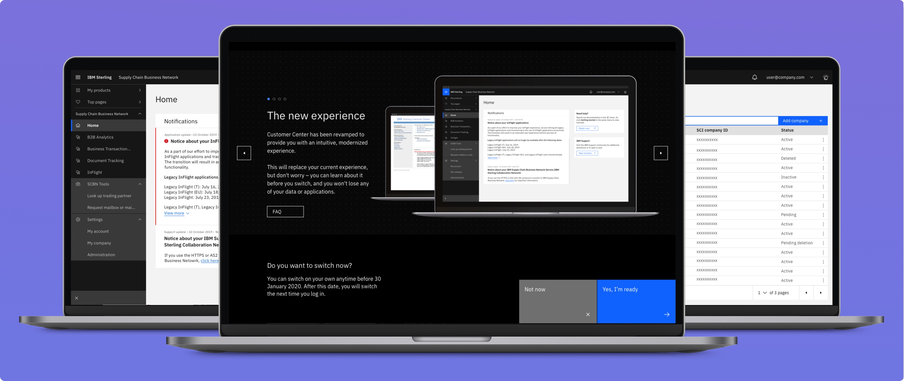
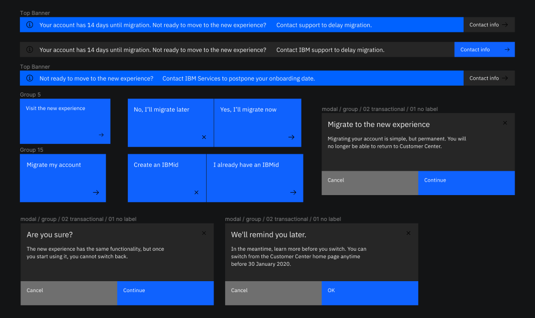
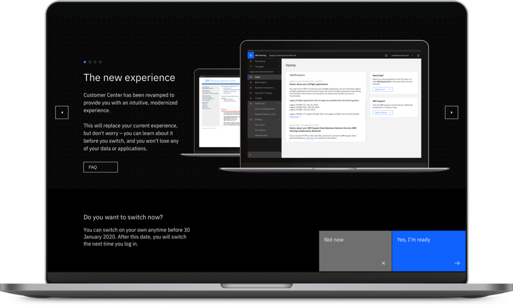
Previous product redesigns efforts have often been met with negative feedback in Net Promoter Scores (NPS). The most common issues in the provided feedback were the perceived loss of functionality (due to existing features hidden behind other layers), actual loss of functionality and difficulty finding core features due to a more minimal interface. Users wanted to make sure that the functions that they needed were just as available in the redesign, as they were in the legacy product, without spending a lot of time to figure out where to find different features. To ease users into the experience, we created a migration process; once user accounts had been marked to transition to the new experience, they would have 30 days to be able to read and preview the new design, and have full control within the 30 day period to move to the new experience when comfortable.
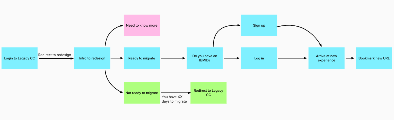
Call to Actions
We explored different opportunities for the user to accept or temporarily decline the migration to the new experience. Initially, the call to action was a single 'Visit the new experience' button, and users would need to contact IBM Support in order to delay their migration past a 14 day period. That evolved to a two button interaction and the extension of the 14 day period to 30 days. This allowed for us to avoid 'locking in' the user into the migration and provide them plenty of time to migrate when comfortable. We decided to add modals to each button interaction, to both, comfort the user that they will not be automatically migrated without being reminded first and also to allow a way out if they were ready to migrate, but changed their minds.
Messaging and Content Design
In order to allow the users to familiarize themselves with the new experience, we needed a method of previewing the redesign. Unfortunately, due to development limitations, we weren't able to allow trial periods, so we needed to find a different solution. We explored different methods and content to inform the user of the new features, but wanted to reassure them that it would be a quick process, and they wouldn't lose any functionality. Different methods that were explored include an animated video, brief single page and in-depth multi page descriptions. Ultimately, we chose to use a 4 panel carousel, providing brief descriptions of what's to come, as well as easy entry to an FAQ page to address any questions the user may have about their workflow, the migration process, or their data.
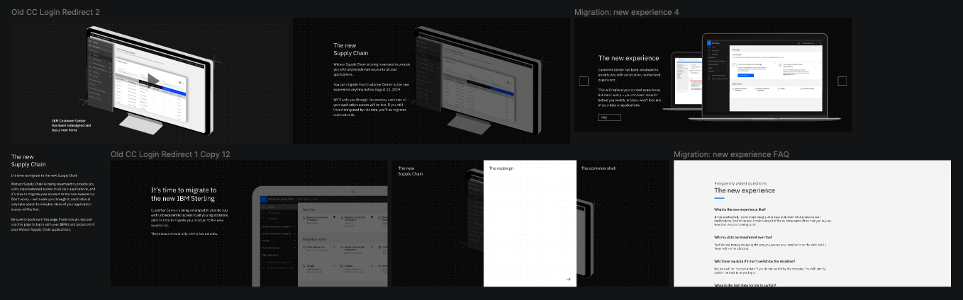
Walkthrough Experience
Once the user has decided that they are ready to migrate, we had to decide where to lead them next. Initially, once the user had clicked migrate, they would immediately be taken to the new experience and begin their workflow. In order to make the transition as easy as possible, we decided to create a multi-step walkthrough to lead users into the updated experience, assuring users that we aren't leaving them behind.
Reflection
Due to the large scope of the project and short timeframe, we had to take advantage of any easy wins that we could find. Low cost design decisions that can improve the experience are your best friend; developers and project managers love them too! Redesigns don't need to reinvent the wheel for every decision and that's okay. For example, revamping the forms by identifying and removing unnecessary fields requires low development effort and a greatly improved experience for users.
Our team for this project was scattered throughout different locations. Being able to share thoughts, sketches and low-fi designs was the key to our success. Work doesn't have to be complete (or anywhere close to) before you can start showing development; discussing early ideas helped our developers start building out their back end to fit our needs. Communicating and sharing work on a weekly basis allowed for design and development to be on the same page and bring each other up to speed, so neither were hit with unexpected surprises.